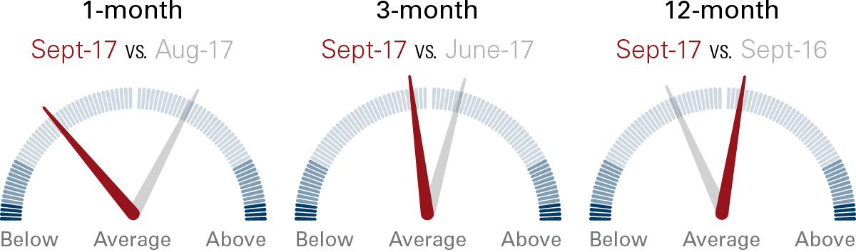
Figure 1: Vanguard’s Canadian risk speedometers, September 30, 2017

By Todd Schlanger, Senior Investment Strategist, Vanguard Canada
(Sponsor Content)
As part of Financial Literacy Month in Canada, we are proud to announce the launch of Vanguard’s Canadian risk speedometers.
These speedometers were originally designed by my colleagues in the United States to provide a factual representation of how investor risk appetite is trending today, relative to the past.
In order to generate the speedometers, we calculated net cash as a percentage of total assets under management, (in this case, within the universe of Canadian mutual funds and ETFs) into high-risk and low-risk asset categories. We then looked at the relative cash flows into high- versus low-risk asset classes, relative to history.
The end result is a risk measure that can be tracked through time and displayed in a risk speedometer index, as shown in Figure 1 over the 1-, 3-, and 12-month periods ending September 30, 2017. When risk appetite is above its historical average — such as over the 12-month period — the needle is to the right of centre, indicating higher risk appetite. When the needle is to the left of centre, risk appetite is below average. In addition to the current risk appetite readings, we also display the prior 1-, 3-, and 12-month readings for comparison.
Notes: Vanguard’s risk speedometers measure the difference between net cash flows into higher-risk asset classes and lower-risk asset classes, in this case within the universe of Canadian mutual funds and ETFs. The lighter-shaded areas represent values that are within one standard deviation of the mean, which means they occur roughly 68.2% of the time (34.1% higher and 34.1% lower). The middle shades represent readings between one and two standard deviations from the mean, occurring 27.2% of the time (13.6% higher and 13.6% lower). The dark edges represent values more than two standard deviations from the mean, occurring the remaining 4.6% of the time (2.3% higher and 2.3% lower). Speedometer values for previous periods may change from what was initially reported as the current value in prior periods because of changes made in Morningstar, Inc., data, and to the updating of the five-year average.
Along with the risk speedometers, we will be providing underlying asset category details (the top winners and losers in each category) in terms of net cash flows and changes in assets under management that resulted in the current risk appetite readings, as shown in Figure 2 (for the same periods, ending September 30, 2017).
Figure 2: Highest net inflows and outflows Continue Reading…


